A digital wallet. Never store your cards on merchant servers.
For a year, I was working on the Native Masterpass SDK for iOS and Android platforms.
I was the sole designer for the project that included 3 project managers, 2 product owners, 1 server architecture lead, 6 iOS engineers, 6 Android engineers, and 2 QA engineers.

Through a process of identifying variables and user choices, we developed a user path diagram, and slotted it into the larger Masterpass web-based system.

The three major experience paths are based around whether or not we can identify a visitor.

These three experience paths spawned 117 possible usage scenarios over the mobile and web implementations.

Our dynamic "Phone or Email" input eliminated a user decision and page refresh seen in the web version of Masterpass.

We cut registration by 30%, made authentication flexible, and able to detect what's available on your device.

Adding a new card during checkout.

Masterpass was available on both Android and iOS platforms, and the apps share a common design language while keeping native interactions.
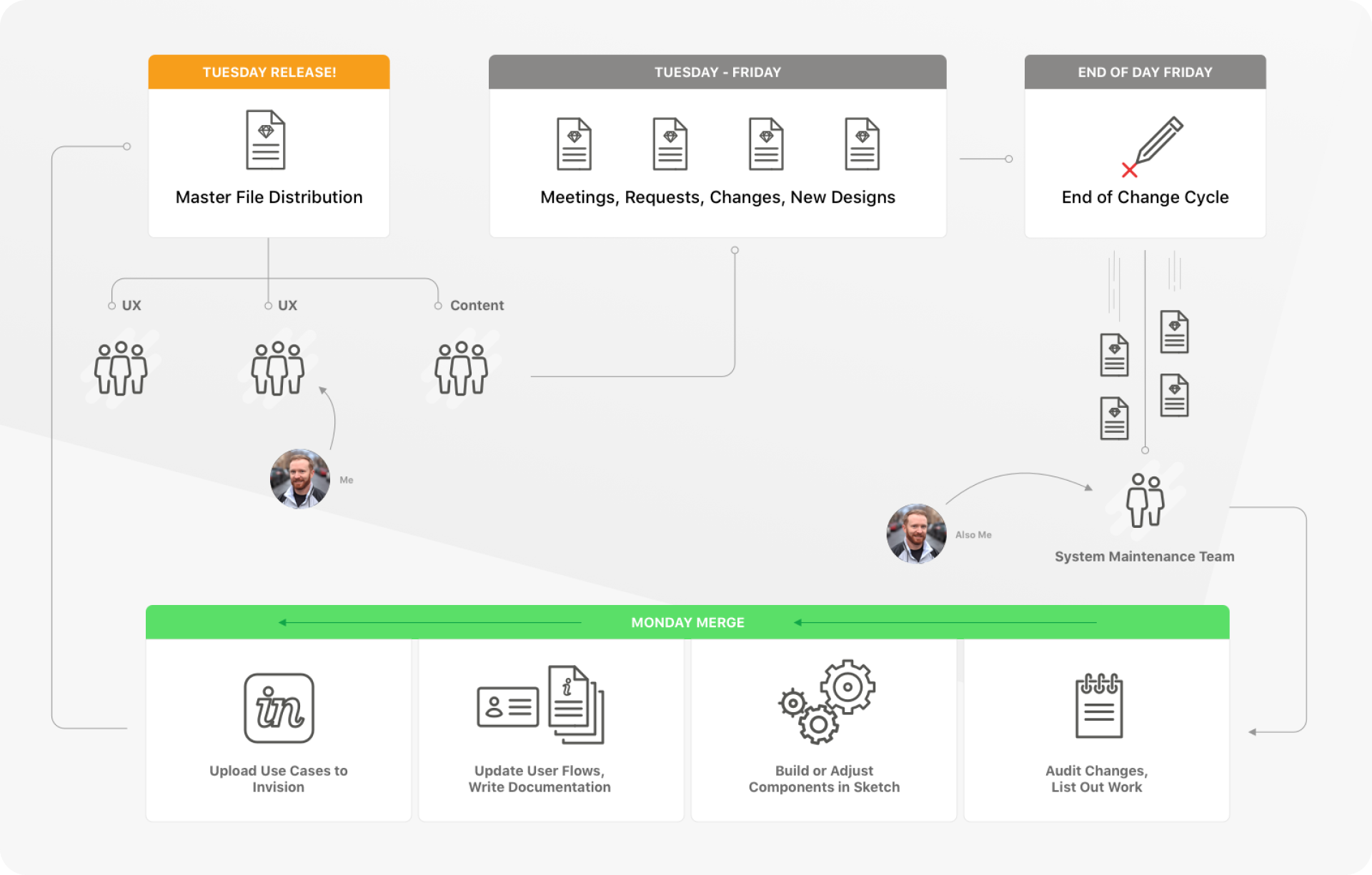
Design library. Manual merging, the horror!
Design tools have come a long way. I look back on this time in absolute shock that we actually had to do this kind of work.

I was part of the design system maintenance sub-team, that would manually merge changes from designers throughout the week, then re-release the DS to the team every Tuesday.

We had an atomic designed system, in Sketch, that had elements nested through multiple layers up to full screen designs.

Screens nested into flows. These were used in the Use Case Navigator that had 117 different scenarios.
Launched. 3 languages in 13 countries.
The Masterpass Native SDKs launched in Q1 of 2018 with support for English, Spanish and French. Working with the team was a pleasure, and I learned a ton about what you can and can't do in the payments space.
It also helped inform how I think about design team processes, the maintenance of the work we create, and how differently people use a tool when it's given to them.


 www.mongodb.com